First look: Updated branding
Having a little refresh!
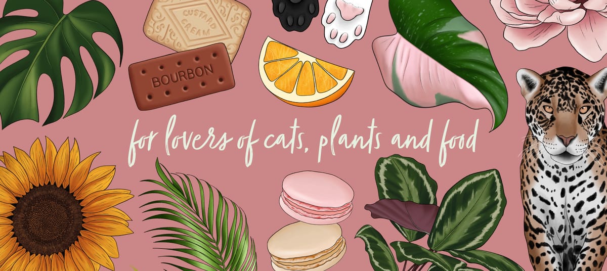
So, I wanted to update my business branding a bit, but not do a complete overhaul. I am keeping my logo, as I only rebranded with the current one just over a year ago, so I more just wanted to update colours and fonts. And I don't know why to this day I am still amazed what a change simply changing colours and fonts can do.
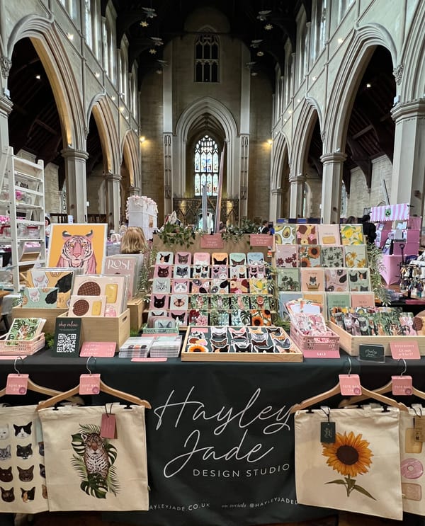
So here's a look at my current branding:
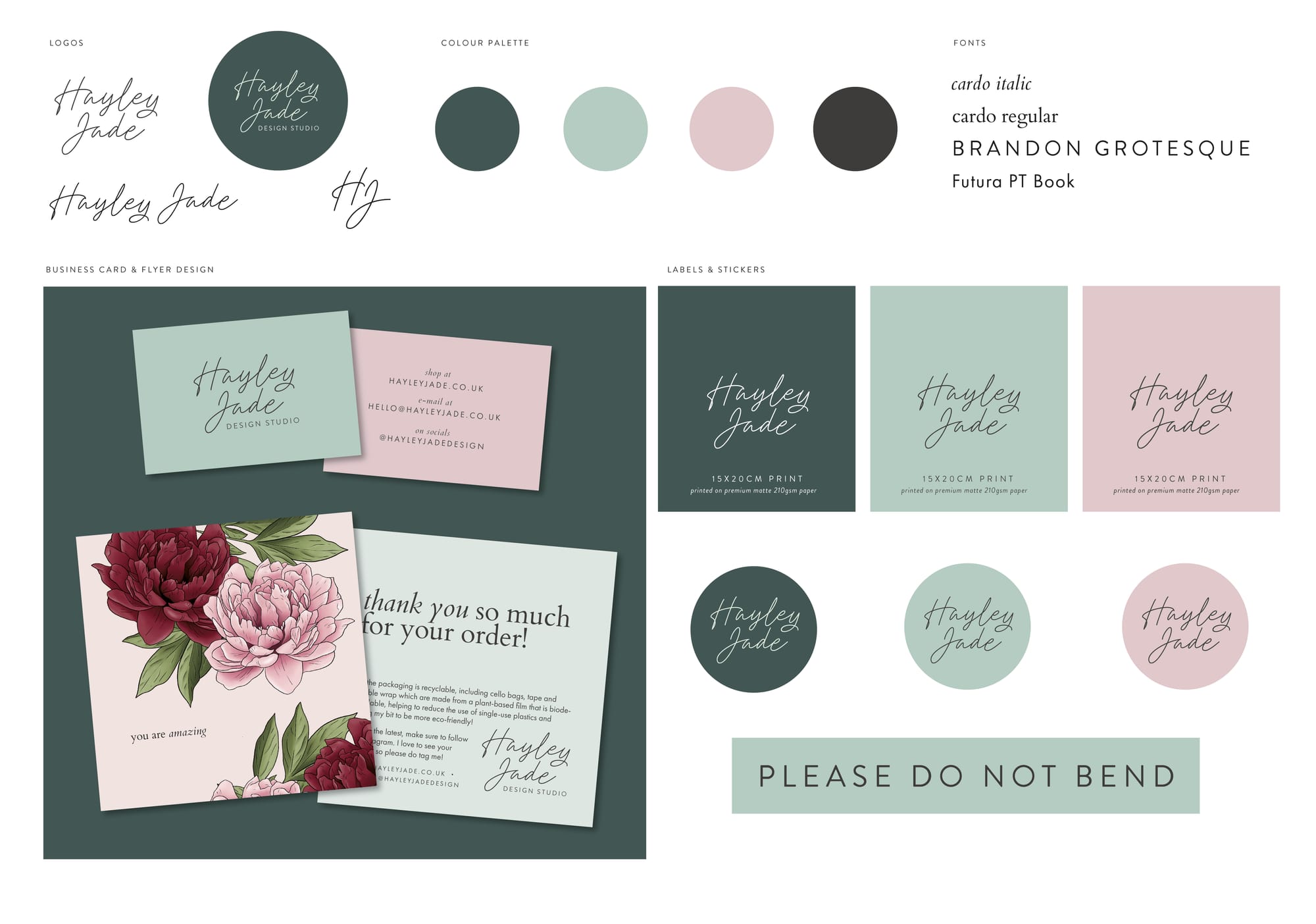
Last year, I moved to be more green focused whereas before it was pink, but I still wanted elements of pink, so had it as my secondary colour. It has a more softer, pastel feel to it, feels more classic, especially paired with a serif font, which at the time I felt worked with the predominantly floral illustrations I had. But felt with the addition of food, plants and cats, I wanted to change it to make it so it worked with all my illustrations.
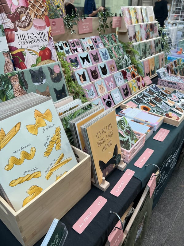
And here is the new!:
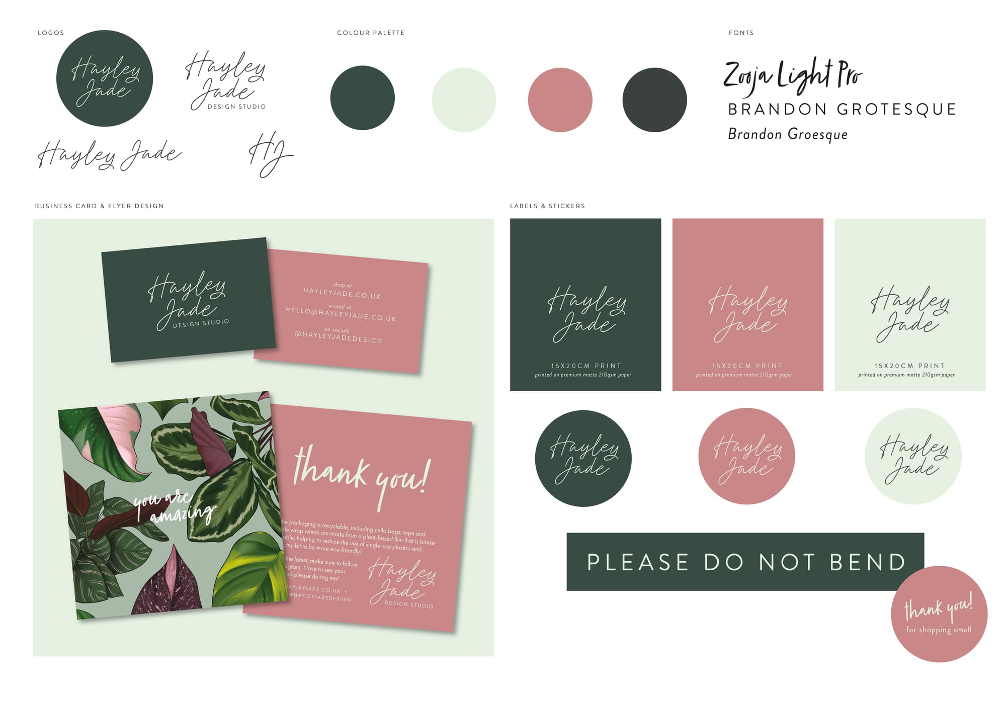
So not a huge change, but it feels a bit more fresher, more modern, and moving away from serif fonts and using a handwritten font for headers and titles, as well as using a bolder pink in place of the previous pastel.
I am also having a little update of my website. Nothing major, just little bits being tweaked to go with the new fonts and colours. It's been the same as it is for a few years now. My husband is the ones who builds it, based on my designs, so over the Christmas break we'll get hopefully a shiny new website up and running, ready for the new year.
There will be a bit of a transition of branding over the next few months, and I'm hoping to have most things done and sorted by the new year. I'll be adding some products with the current branding colours to next months sale, which starts Christmas Eve for paid members and Boxing Day for everyone else, alongside some mystery bundles!


