Design Tips - Using Fonts
Tips to make sure your graphics and design are legible and look the best they can be!

I thought I'd share some design tips when it comes to using fonts in design. Whether it's designing a product, branding or even laying out a simple document like a CV, having something be legible and easy to follow, makes all the difference!
How many fonts?
When it comes to using fonts as part of your design, whether it be branding, graphics or writing a CV, the general rule of thumb is to ideally have no more than three fonts (this doesn't have to include your logo in the case of branding). And to make sure those fonts compliment each other!
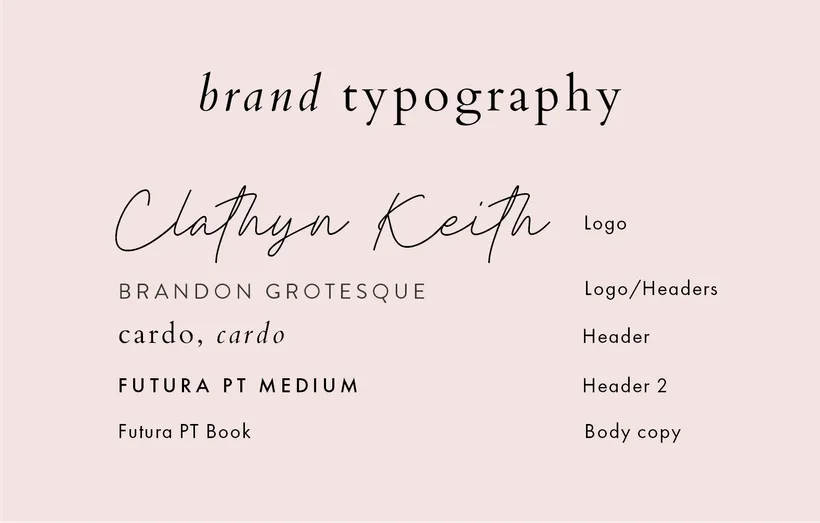
So for example, there are three primary fonts I use for my branding:
Cardo (lowercase, regular and italic with letter spacing of 100) - Headers
Brandon Grotesque (uppercase, with letter spacing of 200) - Headers
Futura PT Book (sentence case, no spacing or uppercase with a letter spacing of 200) - Body copy/Headers
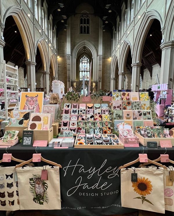
I use these fonts across my website, printed. branding (such as business cards) and graphics, where I can. I only ever use the script font for the logo mark.
The main reasons I believe it is best to keep the amount of fonts to a minimum is for legibility, making it easy to follow but also, consistency. There is nothing worse than seeing a brand using multiple different type of fonts across their branding. Being consistent makes your brand/business look more professional.
Legibility
It's so important to make sure you choose the right font for the application. I see so many examples of fonts that are just not suitable - script fonts used for body copy being the worst example I can think of right now.
So, what type of font should you use for what?
Script & Decorative
For headers, logos and words or phrases that you want to stand out (assuming it's a 3-5 words at most), script and decorative fonts are fine for this. Please do not use them for body copy, or even it's a couple of sentences, it's really not nice to read when it's small!
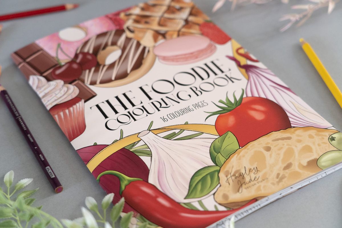
Here is an example of how to use a decorative font:

The font I have used for 'The Foodie Colouring Book" is fine for a header or title. Using this font as body copy, would make it impossible to read, as it's a decorative font that is best used when in a larger type.
Sans & Serifs
What is a san and what is a serif, is the first most important question?
A serif font has the extra lines, the most popular known font probably being Times New Roman, and is commonly used for books and newspaper copy.
A sans font doesn't have the lines, hence the name sans, and is much more widely used for body copy in digital. Well-known sans fonts include Ariel and Helvetica. This article is all written in a sans font!
To be honest, there's probably not anywhere you can use a sans or serif font where it won't be suitable, but there ARE times when one is better than the other (sans tends to be more preferable for digital), and also how you use them too. So no to using an all uppercase letter spaces sans font for body copy - below is an example of this:

It's not very nice to read, the letter spacing is too much and I just feel like I'm being shouted at when there's a significant amount of text in all caps.
Spacing for body copy text should be kept to a minimum, even when all in sentence case.
Here is that same text but in sentence case and no letter spacing. Much more readable!
Handwritten
Like with script & decorative fonts, handwritten fonts should be used sparingly in design, for things such as logos and headers, and not for body copy at all.
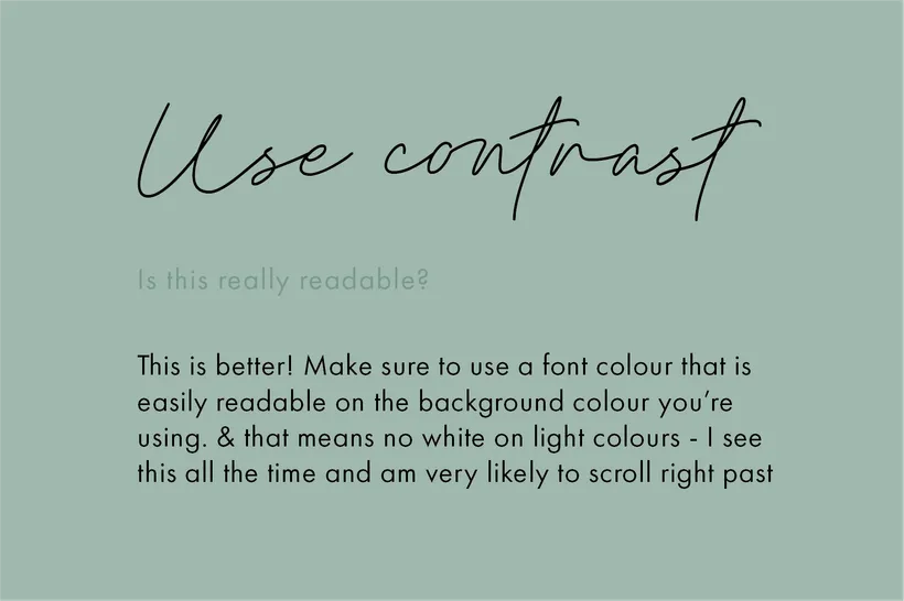
Contrast
Along with choosing the right typeface for what you're designing, choosing the colours, and the background colour that the text will sit on, is also equally important. The amount of times I see pink text on a pale pink text background... I will just skip past it if I cant read it.
So make sure to use a darker text on a lighter background, and light text on a dark background. If you're going to use a dark background, try and not use pure black with white text, and go for a dark grey with a light grey text (but make sure the contrast is enough!) as it'll be easier on the eyes to read. Both too much and not enough contrast are issues!
& that's it (for now)!
Knowing some basics like what fonts to use and how to use them will make a huge difference in what you're designing. I'm no expert on typography at all, there is so much more to it than I don't even know, but with people using products like Canva, designing graphics and the like has become easier and more accessible to more people, but unless you know how to use it, and have a basic understanding of good design, you can still create not so pretty designs.
A tool is only as good as the person using it. Having a camera doesn't make you a photographer, so using tools like Canva doesn't make you a graphic designer, but if used correctly can create good results!